The Jackie Chan brand: His logo explains the corporate identity behind a clever design.
Over the decades, the former kung fu clown Jackie Chan has not only become a serious actor and filmmaker, but also an internationally lucrative brand. But what’s behind the well-known Jackie Chan logo is more than just sophisticated marketing and design.
There have been a number of logos associated with the Hong Kong star throughout Jackie’s career. There are so many more known among fans than the average consumer is aware of – no reproach, after all, even film experts and colleagues find it difficult to keep track of things.
In a later article, I’ll go into more detail about Jackie’s development process as a businessman and the appearance of his numerous companies. This article aims to explain the Jackie Chan brand using its current logo. Incidentally, this is not my own interpretation, this is the official description of the Chan logo, which is supplied as a tag with many merchandise products.
In the beginning there was the dragon …
Jackie Chan’s real name is not Jackie Chan at all. Actually, Jackie Chan isn’t actually born Sing Lung or Cheng Long either. And strictly speaking, there is another, older name in addition to his maiden name Chan Kong-Sang. Father Charles Chan Chi-Ping actually came from northern China and was called Fong Dao-Long and fled to Hong Kong, where he changed his name and had his son Chan Kong-Sang with a new wife, Lee-Lee Chan. If you trace back Jackie’s roots on his father’s side, Jackie Chan’s name is in the ancestral book as Fong Si-Lung.
What does all of this have to do with Jackie’s logo and its worldwide recognition value? Just so much as to understand that names are just all hollow words, especially in Hong Kong and Chinese show business. The Chinese name Cheng Long (Sing Lung) came up at a time when film producers were desperately looking for a replacement for Bruce Lee. Lee was the “little dragon”, Sing Lung thus became the “emerging/rising dragon”. The English name originated in the late 1970s under Lo Wei as Jacky and became Jackie at Golden Harvest.
Since then, Jackie Chan has been known as the real dragon. And that’s exactly how his trademark is built.
Jackie Chan’s logo explained
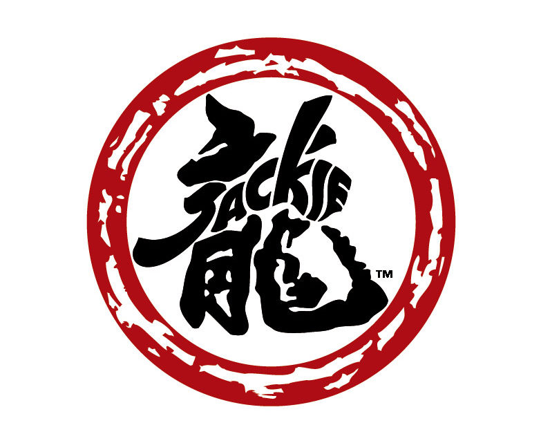
Without a lot of frills and only with two colors, red and black, Jackie Chan’s logo has been around since 1999. At that time mostly without the optically closing ring, but already professionally designed. The flat design is timeless and internationally understandable. But there is more to it than just an icon and a stylized name.
As explained above, Jackie Chan’s name has long been known around the world. The two syllables can be easily pronounced in almost any language, albeit with a few acoustic modifications. It goes without saying that his marketing is cleverly positioning this name in a logo.
In the second design element, the Chinese character for “dragon” (“long”, pronounced “lung” in Cantonese). This not only represents Jackie’s last name in Chinese, Cheng Long, but also represents the entire Chinese culture, which Jackie Chan has been trying to preserve for many years.
The strength of will of the dragon is evident in the red ring of fire all around. But there is another meaning behind it: The furrows and holes symbolize the earth with its continents and islands and thus ensure a worldwide connection like in a family. The fact is that Jackie calls his stunt team and fans the “Jackie Chan family” and he is considered a big brother himself.
The perfection of Jackie Chan’s logo becomes clear in the last design element: The dove symbolizes peace in the world and is integrated into the Chinese characters at the perfect spot, in the ascending direction of flight. Peace is Jackie Chan’s drive, which is why he makes films at all today, because with the fortune gained from it, he has not only supported charitable campaigns around the globe since the 80s, but also founded several charity organizations that are active worldwide, building schools for children, donate clothes and bicycles, support older citizens and so much more …
A logo makes history
Since the trademark registration of the ingenious Jackie Chan logo as we know it today, it has already been used in many variations. For example in the film company Jackie & JJ Productions, which has been run by the Chan family, consisting of father Jackie, mother Joan Lin Feng-Chiao and their son Jaycee, since 2009 (the logo did not appear until around 2011).
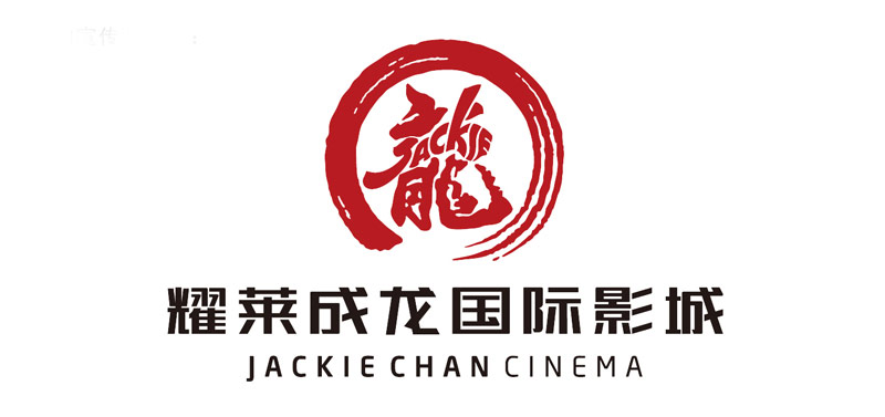
In 2010, Jackie also opened his own cinema chain, Jackie Chan Cinema, with partner Sparkle Roll Group Ltd. with the intention of showing more local Chinese films and thus drawing attention to the young talents that the Chinese film industry so desperately needs.
From this partnership, the new Chinese film company Sparkle Roll Media emerged in 2015 with the same logo as that of Jackie & JJ Productions.
Jackie also does motorsport: He met the racing driver David Cheng in 2015 and unceremoniously founded the Jackie Chan DC Racing team for the coming season. Since then, more and more successes have been celebrated.
Oh yes, then there is the Jackie Chan Movie And Media College, that was also founded in 2015, at which Jackie’s own foundation supports and educates young talent in the film sector with scholarships.
The list could go on almost forever.
The Zen/Chan variant of the fire ring
If you compare the logos shown above, you will notice that the so-called ring of fire has been modified in the version for Jackie Chan Cinema and Jackie Chan Movie And Media College. Coincidence? I do not think so.
Chinese culture is very symbolic and visually powerful. I found out that especially in Zen Buddhism, the circle is a symbol for emptiness and perfection at the same time. Here is an excerpt from Wikipedia which, in my opinion, explains the use of the circle symbol:
Zen (Chinese: 禪; pinyin: Chán; Japanese: 禅, romanized: zen; Korean: 선, romanized: Seon; Vietnamese: Thiền) is a school of Mahayana Buddhism that originated in China during the Tang dynasty, known as the Chan School (Chánzong 禪宗), and later developed into various schools. The Chan School was strongly influenced by Taoist philosophy, especially Neo-Daoist thought, and developed as a distinct school of Chinese Buddhism.[1] From China, Chán spread south to Vietnam and became Vietnamese Thiền, northeast to Korea to become Seon Buddhism, and east to Japan, becoming Japanese Zen.
Source: https://en.wikipedia.org/wiki/Zen (status: March 3rd, 2021)
Zen or Chan therefore means “state of meditative immersion”. And where does a normal mortal person experience such a state? In the cinema, when you can let yourself go and sink into a story. Of course, budding filmmakers are trained in this mindset, this cinematographic feeling in Jackie Chan’s film school.
Even if this is only my guess and there is no official explanation for this logo variant, I still consider it logical. Especially in view of the fact that both institutions were founded in the People’s Republic of China and thus have more to do with the Chinese Buddhist teachings than the original logo with the ring of fire, that had its origin in Hong Kong, which was under the British flag and had a much more western touch.
In addition, the Zen/Chan circle is drawn in the style of a calligraphy, while the original ring of fire stylizes the world with its islands and oceans. Also, Zen Buddhism is called Chan Buddhism in China – I don’t have to add anything more.
Intro: Sparkle Roll Media
And this is how the current Jackie Chan logo with a ring of fire looks in an animated form.


[…] the ring of fire has been used for many years – everything can be found in my article “The Jackie Chan brand: His logo explains the corporate identity behind a clever design.” – it was only logical to finally do it using your own family business in the film […]
[…] There is more to report and a lot to explain about this new Jackie Chan logo. You can find more about this in my article “The Jackie Chan brand: His logo explains the corporate identity behind a clever design.” (Click here). […]