The Jackie Chan brand, part 2: Developing the Sing Ga Ban stunt team logo
Jackie Chan is not only a star by himself, but has also brought many stuntmen to cinematic fame around the world. In 1976, he founded the Sing Ga Ban, the Jackie Chan stunt team, which is still active in its 8th generation today. The development of Jackie’s own cinematic success, political circumstances in Hong Kong and China as well as the globalization of the film industry contributed to the constant change of the stunt team – both in terms of personnel and appearance.
Logo history of the Jackie Chan stunt team
In the more than 40-year history of the Jackie Chan stunt team, not only has the team itself gone through changes, but also its appearance. The following descriptions do not claim to be a detailed process of a corporate identity, but are only intended to highlight the most important milestones over the decades.
Hong Kong, 1976. The founding of the Sing Ga Ban (成家班) cannot be imagined in a highly official manner with officially certified documents and trade license. In the beginning, there were a few stuntmen under Jackie Chan’s direction, who stood up for more rights and better pay in Hong Kong films. In 1976, there was still no distinguishing feature such as a logo or a claim.
Well, there was this one incident that first-generation stuntman Wang Yao told about when he met all his buddies live on TV: Jackie gave him his leather jacket while shooting in Taipei, Taiwan. And on this leather jacket, next to a badge displaying a cameraman on a crane, the slogan “We do movies better ‘cos movies are all we do.” It is not known exactly when this jacket was produced.
The first Jackie Chan logo
Something like a logo first appeared in 1980/1981 when Jackie founded his first film company, Authority Films, under the parent company Golden Harvest, in order to have more control over his films. The plan of this small film company didn’t work out in the end, but a golden dragon was chosen as a recognition factor for the upcoming second generation of the stunt team, which should allude to Jackie’s name (Cheng Long = Becoming a Dragon). The inscription “J.C. Stuntmen’s Club” was added to this inscription, which was usually written in a bow underneath – this bow will still play a decisive role in the later history of the logo.
Source: Glorious History of 20 Years Jackie Chan (4-7648-1911-2)
The early 1980s were extremely turbulent: breakthrough on the Japanese market, persecution and threats from the triads, court hearings with Lo Wei for breach of contract, secret wedding with Joan Lin Feng-Chiao and their offspring, suicide incident in Japan of a female fan, transforming film plots from the Qing dynasty to the modern age.
Jackie Chan’s first fashion store
In 1984, Jackie Chan opened his first clothing store in the middle of the lively Hong Kong city center. In the popular “Mira Place” shopping mall on Nathan Road, there was the Jackie® Collection – leisure textiles and slightly more upscale fashion for men and a separate women’s department. The shop was adorned with memorabilia from Jackie’s young but successful film career as well as photos of his stunt team.
The two Chinese characters will still play a role in the course of the logo development. Just like the Jackie lettering, which is still used today in an optimized form.
New start with Golden Way Films
It was time for a breath of fresh air, and so in 1985 Jackie’s first production company was restructured, renamed Golden Way Films and thus ensured more affiliation with Golden Harvest, both by name and visually with a suitable intro. The Sing Ga Ban also got a new look, Jackie’s initials JC with the addition “Stuntmen’s Club”.
This can even be seen in the film “Police Story” (1985) because the JC Group’s team van is parked in the background of an action scene. There was also a modification of this logo, so in later textile prints the initials were often supplemented with dots “J.C.” and the former dragon was used in a different pose underneath.
Source: Police Story 2 Mook “九龍の眼” (Japan 1988), “Police Story” screenshot (Golden Harvest, 1985), “40 Years of Jackie Chan Stuntteam” book (China, 2017))
Up to this point, the logos were only printed on shirts, caps, pullovers and other items for official team members, in order to strengthen the team spirit and to show the curious public on film sets “This is where the Jackie Chan stunt team is shooting”. But with the success of the founded Jackie Chan International Fan Club, which published a bilingual fan magazine several times a year (English and Japanese), the paying fans were now offered their idol’s first merchandise. From then on, the “JC” logo was even featured on jewelry.
The dragon learns to fly
In 1987/88, first attempts were made to design the Chinese character for “dragon”, namely “Long” (pronounced “Lung” in Cantonese) as a logo and to print it on textiles for the stunt team. Since the team was becoming more and more the focus of the West, it was often simply called JC Group and supplemented with this very lettering. However, since the results left a lot to be desired, this variant did not prevail – not for the time being. The sign still hung in the office and was probably responsible for the brilliant idea in the 90s.
Source: J.C. Int’l Fan Club Magazin #33 (1988), J.C. Int’l Fan Club Magazin #36 (1989)
Just like ten years before, the 90s were turbulent again for Jackie Chan: Golden Way Films no longer existed, from 1995 he was slowly noticed in the West, especially in Hollywood, the breakthrough worldwide with “Rush Hour” (1998) the publication of his autobiography, the founding of various companies such as Jackie’s Kitchen and Planet Hollywood HK, the 1998 launch of his website www.jackie-chan.com and the last film for Golden Harvest. From now on, Jackie was not just a megastar but a global brand that he now wanted to make marketable worldwide from Hong Kong.
Jackie Chan Design
In 1998, the company Tide Mark was founded, producing fan textiles for Jackie Chan. They experimented even more than in previous years, so that almost every new product was given a new logo or appearance that was reminiscent of Jackie Chan in some way. At the very front, however, the initials “JC”, which started in the stunt team, were always there.
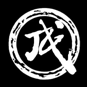
But as early as 1999, the team of Jackie Chan’s designers developed the logo known today, which reinterprets the “Long” logo from the 80s and makes it internationally recognizable. At that time still without the fire ring, but already designed and printed on textiles for the Jackie Chan stunt team (see the documentation “Jackie Chan – My Stunts” (1999)).
There is more to report and a lot to explain about this new Jackie Chan logo. You can find more about this in my article “The Jackie Chan brand: His logo explains the corporate identity behind a clever design.” (Click here).
In 2003, after Jackie split from his long-time partner Golden Harvest (the company was restructured after Leonard Ho’s death), he and Albert Yeung founded JCE Movies Limited in Hong Kong under the parent company Emperor Motion Pictures. With this, Tide Mark became Jackie Chan Design, which still exists today (www.jackiechandesign.com).
JC Sport/JC Studio under Jackie Chan Design
Since then, the initials “JC” in many variations have been emblazoned on the products manufactured in Hong Kong and China. A sub-category was called “JC Sport” and, in addition to the lettering, also contained the earlier character for dragon, “Long” (pronounced “Lung” in Cantonese).
Jackie Chan’s projects developed rapidly over the years that followed. New generations grew up and new consultants stormed the field. In 2008/2009, Willie Chan retired and left the field of Jackie’s manager to others. In the same year, the Jackie Chan brand was visually adapted to the aforementioned fire ring, and the company “Jackie & JJ Productions” was founded: a film company headed by Jackie Chan, wife Joan Lin Feng-Chiao and their son Jaycee. From now on, the well-thought-out logo of the Jackie Chan brand was emblazoned everywhere and picked up on tried and tested elements.
Since then, this brand logo has adorned all Jackie Chan Design products as well as official stunt team items that were produced under this brand. However, since Jackie already had experience with his own fitness studios and offered some useful products such as bags and drinking bottles for members, he now took this sport series to the next level: JC Sport became JC Studio and a new variant of the “JC” logo was created.
Back to the roots
The last change to the external appearance of Jackie Chan’s stunt team took place around 2015 with the establishment of the Chinese film company Beijing Sparkle Roll Media and the opening of the stunt school, the JCST Training Center, in China. From here on, all tried and tested elements such as the dragon, the “Long” logo and the “JC” initials are combined. Jackie’s own stunt school, which is run and used by the Sing Ga Ban, also features the new slogan “Action & Power”.
A noble variant of the JCST logo can be admired at highly official events and in the JCST training center. The slogan “We bring action home and all over the world” is emblazoned on the banderole (analogously).
There was a special surprise for all former and current members of the Jackie Chan stunt team in 2017, when the first Sing Ga Ban logo was relaunched and merged with the current stunt team logo. The occasion was the celebration of the 40th anniversary of the Jackie Chan Stunt Club.
Conclusion: the two Jackie Chan brands
Long story short: Today, there are two registered trademarks that are associated with Jackie Chan and his stunt team and are used extensively by both. The well-known, designed Jackie/”Long” logo as well as a separate logo for the Jackie Chan stunt team.