Film logos and their meanings: Jackie Chan’s film companies and their intros from 1980 to today
At the tender age of 26, Jackie Chan founded his first own film production company. It wasn’t successful, but it laid the foundation for what fans around the world know as »The road to Chan«. As a filmmaker he exercised more and more control over his projects and worked with the greats from Hong Kong and China – until today.
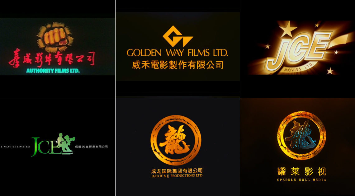
Authority Films Ltd.
When Jackie Chan terminated his contract with Lo Wei Motion Picture Co. in 1979 and switched to Golden Harvest – I cover these circumstances in more detail in earlier articles – a subsidiary called Authority Films Ltd. was created out of nowhere. Its CEO was Jackie Chan.
The background is not known, but the following can be assumed: Golden Harvest paid an unknown but horrific transfer fee for its new star Jackie Chan and of course wanted to make a profit from the investment. Since Jackie’s planned films required a lot of time but Golden Harvest wanted to tighten the screws quantitatively, more films should bear Jackie Chan’s signature and make money at the box office.
Whether that was the exact plan can only be concluded today. In the end, however, it did not work. Authority Films Ltd. produced only three films in the (legal) turmoil surrounding Jackie Chan between 1980 and 1982: “Read Lips”, a contemporary action comedy with Frankie Chan, “The Gold Hunters”, an action comedy in the style of the old Eastern by and with Fung Hak-On, as well as “Dragon Lord”, the second big blockbuster film by and with Jackie Chan for the parent company Golden Harvest.
Some sources give an exact period of the activity of Authority Films Ltd. without reference to: 15.09.1980 to 13.02.1982. These dates represent the release date of the first film produced and the theatrical exit date of the last film produced. In fact, the company existed on paper until 1985 (more on this later).
Authority Films Ltd. (拳威影片有限公司)
Nicknames: The Fist from Hell, The Punch of Doom, Nightmare on Authority Street (as a reference to “Nightmare On Elm Street”)
Logo/Intro: A ray of light, which may shine through a prism, flashes on a black background; Rays in all directions, starting from the center of the screen. An orange-yellow right fist appears small in the middle of the screen, around it several contours as pulsating rays of colour in blue, red and green (from inside to outside). The fist comes closer until it covers the entire screen in orange-yellow, then a fraction of it completely in white and again in black. From the black background, the fist, now drawn in more detail and in a beige shade, cuts through an imaginary canvas, the rags of which hang around the fist. The lettering 拳 威 影片 有限公司 appears in red underneath and in turquoise underneath again in capital letters AUTHORITY FILMS LTD., both averaged on the Y-axis.
Music/sound effects: A classic Eastern fanfare begins dramatically, the volume becoming more intense the closer the fist comes. The punch is accompanied by a classic Eastern punch sound and a male voice shouts “Hoah!” (not Jackie Chan, but probably his Cantonese dubbing voice at the time). A sound of a sheet of paper tearing appears when the black background is smashed and a lightning-like “swoosh” sound ends the intro.
Availability: The intro was only used twice, in “Read Lips” (1980) and in “The Gold Hunters” (1981). “Dragon Lord” does it without the intro and was marketed as a big Golden Harvest blockbuster.
Variations: none
Golden Way Films Ltd.
One can only guess why Authority Films Ltd. was no longer active after “Dragon Lord”. Because at the end of 1983 Jackie’s next big blockbuster for Golden Harvest was “Project A”. Here, however, the responsible film company was no longer Jackie’s own first subsidiary of his employer, but Paragon Films Ltd., which had been realizing projects for large film studios since 1971. Perhaps Jackie’s plan was too big for his “small” company.
The same happened with “Winners & Sinners” and “Wheels On Meals”. In between, Jackie Chan also shot films in the USA but was so frustrated by the experience that he went back to Hong Kong to work on “Police Story”, which was to become his masterpiece.
Not only did he creatively reinvent himself here, there were also changes in business. Authority Films Ltd. was outdated, kung fu films from the Qing dynasty out of date. And so the company was restructured and realigned as a brand – Golden Way Films Ltd. was born, with the well-known goal of producing more films of the new Jackie Chan type in various genres, with and without Jackie Chan in front of the camera.
Golden Way Films Ltd. obviously wanted to develop a closer external relationship with Golden Harvest; the audience should know. For a whole decade, from 1985 to 1995, Jackie’s second film company produced entertaining action comedies as well as artistic dramas and won tons of awards in both genres. The “golden way”, the “Road to Chan”, led Jackie into a world of serious filmmaking.
Golden Way Films Ltd. (威禾電影製作有限公司)
Nicknames: The GW, The Road to Chan, The Golden Harvest Star
Logo/Intro: An orange-coloured Golden Harvest logo slowly zooms in on a black background. A globe rotates around and in between, the latitude and longitude of which are shown in green and the contours of the continents in blue, finding its place behind the Golden Harvest logo. In between, white lights flash from time to time at some corner points. An orange-coloured star with four corners appears in the middle of the screen which grows larger and larger until it envelops the entire screen. Then the star steps back into the center of the screen, turns once to the right so that you can see that it is flat. It continues to spin and evolves into the logo of Golden Way, a stylized G and W that arises from the G. During this animation you can see an orange-coloured street under the logo that the viewer seems to be walking down; the horizon shines in a deep blue gradient to black and where the road and horizon meet a small point pulsates white. As soon as the GW has formed, it flashes once, the street disappears and the words GOLDEN WAY FILMS LTD. in capital letters and below 威 禾 電影 製作 有限公司 appear averaged on the Y-axis, becoming slightly smaller and coming to a standstill and flashing again briefly.
Music/sound effects: There are already two variations: In the first variation, the intro begins with a slight “swoosh” sound. It starts with a synthesizer music, typical of the 80s, which produces isolated drums, some bass and a rising, sublime melody.
Availability: This first variant was only used in “Police Story” (1985).
Variant 2: In terms of animation, this is exactly the same as the first variant, but differs slightly in the music, which here seems less epochal and more subtle.
Variation 3: There is actually an unofficial third variant of this intro. It was only used in Golden Way productions that do NOT show Jackie Chan in the film, i.e. he only appears as a producer. This variant contains the same audio track as variant 2, the animation is also the same, but differs here in colour of the horizon which is blue instead of black. This could technically be explained by a lower quality, but in fact this intro only appears in productions without Jackie in front of the camera. The font is also more yellow than orange.
JCE Movies Limited
After the death of co-founder Leonard Ho in the spring of 1998, Golden Harvest was heavily restructured. In the long term, the studio wanted to pursue other strategies in the market, so after almost 30 years of close cooperation, Jackie Chan and Golden Harvest parted ways. It was foreseeable as early as 1995, which is why Golden Way Films Ltd. was no longer active – for a long time Jackie only produced third-party films under his name.
In a transition phase that lasted several years, Jackie then worked more often with other film studios who built on the success of pioneers such as the Shaw Brothers and Golden Harvest in order to open up international markets. These included the Media Asia Group and Emperor Motion Pictures.
After a few test projects and another trip to Hollywood from 1998 onwards, Jackie Chan decided to enter into a cooperation with the young company Emperor Motion Pictures, founded in 2000, and his business partner Albert Yeung, and founded a new production subsidiary called JCE Movies Limited, which in turn took a whole decade of 2003 to 2013, made for a variety of films.
In fact, the newly founded company was only mentioned by name in the first projects without a logo in the credits. The exceptions were a teaser trailer for “New Police Story” (2004) and the beginning of “Enter The Phoenix” (2004), as seen above. The fact that the appearance of a newly founded company seemed to be of little importance may be strange and not in line with the serious demeanor of the parent company with its noble corporate identity.
The intro is not animated and contains no sound. Pretty dreary. That is why this logo was created a year later:
JCE Movies Limited (成龍英皇影業有限公司)
Meaning: The JCE stands for Jackie Chan Emperor as a reference to the parent company; similar to the Golden Way and Golden Harvest back then.
Logo/Intro: Prism-like rays of light streak across the screen in all colours, slightly curved, recognizable following a gentle pattern. The JCE logo rotates from the center with Jackie as a silhouette sitting on a camera wagon. The icon turns white, then yellow, then green. The letters for JCE MOVIES LIMITED form the first lettering to the left of the icon, the Chinese characters 成龍 英皇 影業 有限公司 to the right of the icon form the second lettering in white.
Music/sound effects: mute
Availability: From 2005 to 2008.
Jackie & JJ Productions Ltd
After ten years of successful collaboration between JCE Movies Limited and Emperor Motion Pictures, Jackie Chan was faced with major changes. Even during this phase, Jackie was drawn more and more to mainland China, where the economy and thus the film market were booming. On the other hand, there wasn’t much left for him in Hong Kong, above all there was a lack of young talent in the industry, and the audience had seen almost every corner of the small metropolis of Hong Kong. So it was time to think bigger.
Jackie & JJ Productions Ltd was formed after Willie Chan, his manager, left the JC Group. The JC Group is an association for promoting the Jackie Chan brand and representing its rights in all matters. Willie Chan handed over management of the JC Group in 2009 to Jackie’s wife, Joan Lin Feng-Chiao, who, together with her husband Jackie Chan and their son Jaycee Chan founded the new independent family company based in China.
The goal of this company differed strategically from that of JCE Movies Limited, which operated in Hong Kong for a short time and mainly produced for the Hong Kong market and ran its business from there (when Hong Kong was incorporated into China in 1997, the system »one country, two systems«, which allowed Hong Kong to continue to operate more autonomously). Jackie & JJ Productions Ltd now had the Chinese system behind them, an audience of billions in Mandarin and relaxed export regulations before their eyes. Large Chinese in-house and co-productions were to be produced with other influential studios around the world, including again with the former business partner Emperor Motion Pictures.
Here, too, a simple logo, already known from the JC Group, was used initially but can only be seen at the beginning of »1911« (2011). Before that, Jackie & JJ Productions Ltd, like JCE Movies Limited, was only mentioned textually in credits. Here, the logo is simply shown on a pastel-coloured background when shortly afterwards the screen is faded out in black.
Since the Jackie logo in the ring of fire has been used for many years – everything can be found in my article “The Jackie Chan brand: His logo explains the corporate identity behind a clever design.” – it was only logical to finally do it using your own family business in the film industry.
This is how this modern intro came about:
Jackie & JJ Productions Ltd (成龍影業有限公司)
Meaning: Jackie’s name naturally serves as the draft horse, followed by the first letters of the names of his wife Joan and his son Jaycee. The translation of the Chinese name actually only means something like “Jackie Chan Film Company”.
Logo/Intro: There are two variants. In variant one, a golden dragon circles comfortably in a black picture until it finally turns clockwise to form the ring of fire of the logo. During the transformation, a golden dove flies into the picture from the top left and forms part of the Chinese character »long« (龍) which now arises from small flames and the self-blending word »Jackie«. While the lettering 成龍 影業 有限公司 underneath and JACKIE & JJ PRODUCTIONS LTD appear in capital letters in gold and slowly get smaller until they have found their place under the logo, the whole logo moves slightly backwards and the ring of fire tips over in front of the “long” away. The entire screen fades out blurred. The entire lettering is actually a bit crooked!
Music/sound effects: A subtle background music, reminiscent of a piece of war from a Chinese opera, fades in while the dragon circles. The sound of drumsticks accelerates until, with a bang, more audible music appears in the foreground: gentle strings and a small piano piece. The sound is also slowly faded out.
Availability: This first logo was only used in “Chinese Zodiac” (2012).
Alternative intro: A year later, the visual appearance of the intro was adjusted a little. The dragon has been given more details and shine, here and there small coloured flashes of light sparkle, which gives the intro more depth. All in all, the dragon doesn’t seem as lethargic as before, rather more powerful and determined. His determination is confirmed by the fact that after first appearing on the screen, he sits up briefly and then continues to fly in a targeted manner. When straightening up you can hear a “roar!” at this point. The dove and the ring of fire are also animated in more detail and the circling of the dragon in the ring of fire is more intense. The lettering has also been straightened here. It seems like the first animated logo was still in the development stage and has finally been rendered here.
Availability of the alternative intro: In fact, this alternative was only used once, namely in “Police Story 2013”.
Sparkle Roll Media
With the first productions of Jackie & JJ Productions Ltd – that company also acts lightly as a distributor for a few films from Hong Kong – interested parties and new business people from China approached Jackie Chan. In order to have more control over the marketing of his own movies as well as to cast young talents and to offer them a platform for their films, Jackie founded the cinema chain Jackie Chan Cinema (耀 莱 国际 影城) in 2010.
Jackie also realized that if he wanted to concentrate on the creative work of his films, he needed a strong partner at his side who could take care of national and international sales. Then an idea occurred to him and he negotiated with his well-known business partner of his own cinema chain.
So in 2014/15 he and the Sparkle Roll Group, a Hong Kong company that trades in luxury goods and with good connections to mainland China and the world, merged and founded the production company Sparkle Roll Media, headquartered in Beijing. Jackie was able to access influential contacts and the Sparkle Roll Group expanded its line of business in the film industry not only in cinemas but also in the production of films.
In fact, the existing new intro from Jackie & JJ Productions Ltd was used for the new company and only the lettering below was changed. Since then it has been 耀 萊 影視 and below it SPARKLE ROLL MEDIA.
Sparkle Roll Media (耀萊影視文化傳媒有限公司)
Meaning: The translation of the Chinese name actually means “Yaolai Film and Television Culture & Media Co. Ltd”.
Logo/Intro: There are again two variants. Variant one is the alternative version of the intro by Jackie & JJ Productions Ltd, except that the words 耀 萊 影視 and SPARKLE ROLL MEDIA underneath.
Music/sound effects: The Sparkle Roll Media logo differs acoustically from its predecessor. Here the melody is completely omitted and the soldiers’ voices in the background can no longer be heard. All in all, this logo intro is much cleaner than the base from the times of Jackie & JJ Productions Ltd.
Availability: normal
Alternative intro: There is a special feature in the intro for the film “The Foreigner” (2017). If you look closely, the logo only differs in one point: the well-known “Jackie” lettering in the Chinese character “long” can no longer be read. Instead, the whole character looks rather strangely grayish. It is not known why there is a special form for this successful international co-production.
Alternative intro 2: There is another exception in the “Sparkle Roll Media” co-production “Wish Dragon” (2021). Here you can see the regular SRM intro, but without the original sound. The audio of the feature film begins almost directly with the film intros in the off.
[…] In the articles “Etta Ng, Jackie Chan’s illegitimate daughter, has her coming out” and “Jackie Chan’s daughter claims she is homeless because of homophobic parents” I explain the background in more detail. Joan Lin Feng-Chiao and Jaycee Chan forgave Jackie and even founded a new family film company Jackie & JJ Productions in 2009. (More on this in the article “Film logos and their meanings: Jackie Chan’s film companies and their intros from 1980 to today“. […]